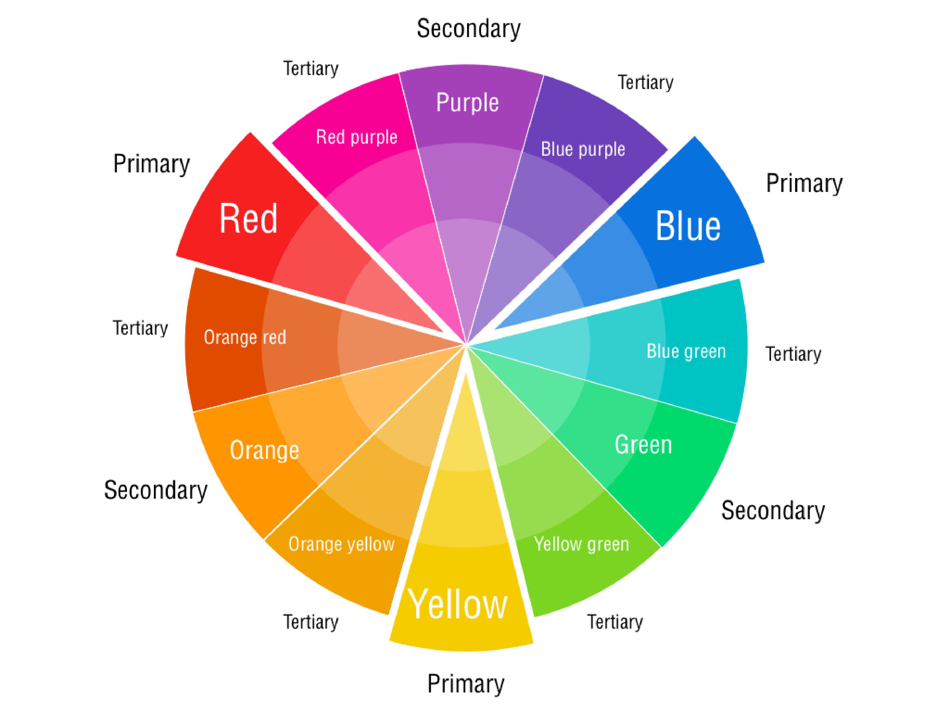
Secondary Colours on The Colour Wheel
Secondary colours on the colour wheel play a crucial role for artists who seek to develop an understanding of colour theory.
Known as the triadic core of the colour wheel, secondary colours are generated by mixing equal parts of two primary colours.
The three secondary colours include Green, Orange and Purple.

Green on the Colour Wheel
Let's look at each secondary colour individually.
Green is a secondary colour that is a result of mixing equal parts of blue and yellow.
Appearing between blue and yellow on the colour wheel, green, for instance, is often associated with life, nature, and tranquillity, making it perfect for landscapes and naturalistic scenes.
Orange on the Colour Wheel
The second secondary colour on the colour wheel is Orange, created by mixing equal parts of red and yellow.
Orange stands between red and yellow on the colour wheel, representing warmth and enthusiasm like a sunset.
Its usage can breathe life into the composition, conveying feelings of joy, positivity, and excitement.
Hence, it's often used for vibrant, lively scenes or elements that demand attention.
Purple on the Colour Wheel
Purple, the third secondary colour, is a mixture of equal parts of red and blue.
Residing between red and blue on the colour wheel, representing creativity and luxury.
Purple, being a blend of red and blue's intensity and tranquillity, signifies luxury, creativity, and mystery.
Artists use violet to convey depth, richness, and sophistication in their pieces.
Understanding the nature of these secondary colours on the colour wheel is crucial for the delicate process of mixing secondary colours.
This knowledge aids artists in achieving the desired hues and shades, expanding their palettes and allowing more control over their artistic expressions.
Aside from their compositional value, secondary colours have inherent psychological and symbolic significance.
Secondary colours also come with the advantage of versatility.
They can be manipulated by adding more of one primary colour, changing the temperature and emotions.
For instance, adding more red to orange creates a warm, fiery orange-red, while adding more blue endows it with a cooler, more laid-back impression.
April 2025
Freebie
May 2025 Monthly Calendar
Download is available!
Recent Articles
-
Are Horses Hard to Draw?
Apr 24, 25 01:26 PM
Horses are big and strong, they have a lot of muscles on their bodies and legs, they have fluffy tails, manes and a beautiful face, so yes they are complicated to draw. Free Tutorial This may be a bit… -
Moving House Pt 2
Dec 11, 24 05:29 PM
OMG boxes everywhere, 2 containers full up, all my crafts packed away, this has all been since May this year and it is now December and I so need to move and get my life back in order and start the fa…